A logo usually starts small. A sketch on paper. A rough idea typed into a notes app. At first, it feels like a single graphic. Over time, that mark becomes the face of a business. It appears on websites, packaging, social profiles, videos, and storefronts. When it works, people recognize it without thinking; when it does not, everything built around it feels harder.
This is why logo design ideas matter more than ever. Many founders now look for inspiration alongside tools that help turn those ideas into something usable. Some even explore platforms that already handle visuals, such as an HD quality photo converter or a photo enhancer, then realize the same system can help shape a logo from the start.
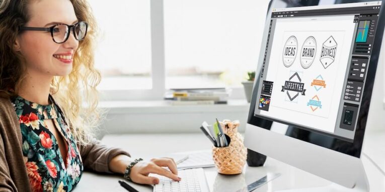
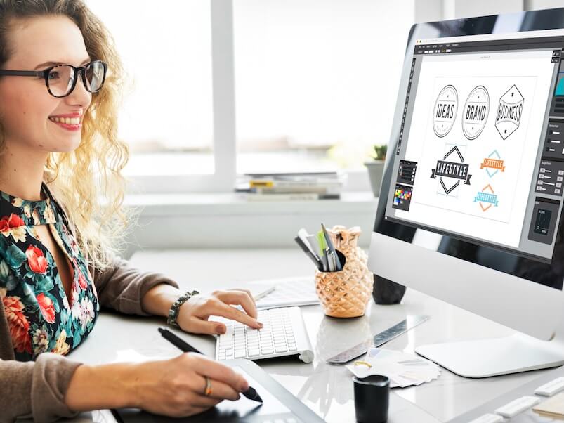
X-Design AI Agent fits in this list as a practical tool for everyday design and business queries. While it can be used as an AI logo creator, it also has functionalities for different business needs like video editing, image enhancement, creating brand kits, product mockups, and more.
Wordmark Logos That Focus On Clarity
Wordmark logos rely entirely on typography. There are no symbols or icons, just the business name treated with care. This style works well for brands with short, distinctive names.
Strong wordmarks use spacing, weight, and letter shapes to create personality. Some lean formal. Others feel playful or modern. The idea is not decoration, but confidence.
When wordmarks work best
- Short brand names
- Digital first businesses
- Companies focused on trust and clarity
Pros
- Easy to read
- Scales well across platforms
- Simple to reproduce
Cons
- Less visual storytelling
- Depends heavily on font choice
Symbol-Based Logos With Simple Shapes
Symbol logos use a single icon or shape to represent a brand. The strongest examples rely on basic geometry or familiar forms. Circles, lines, and abstract shapes often last longer than detailed illustrations.
This approach works well for brands that want flexibility. A symbol can appear alone as an app icon, watermark, or video intro.
When symbol logos fit
- Brands planning mobile apps
- Visual-driven businesses
- Companies expanding internationally
Pros
- Strong visual recognition
- Works well at small sizes
- Easy to animate for video
Cons
- Takes time to build recognition
- Requires consistent use
Combination Logos For Balanced Branding
Combination logos pair text with a symbol. This gives flexibility. The full version can be used on websites or packaging, while the symbol alone works for social profiles or videos.
Many modern brands start here because it allows gradual simplification over time.
Where combination logos shine
- New businesses
- Brands are testing different platforms
- Companies planning long-term growth
Pros
- Versatile
- Clear brand association
- Easier recognition early on
Cons
- Can feel busy if not balanced
- Needs spacing control
Lettermark Logos Built From Initials
Lettermark logos reduce a long name to initials. This approach works well for businesses with complex or multi-word names. The focus shifts to shape and rhythm rather than full spelling.
Good lettermarks feel intentional, not shortened out of necessity.
Ideal use cases
- Long brand names
- Corporate or professional services
- Brands aiming for a clean look
Pros
- Compact
- Easy to remember
- Works well in tight spaces
Cons
- Less descriptive
- Needs strong typography
Hand-drawn and organic logo styles
Some brands move away from precision and embrace imperfections. Hand-drawn logos, uneven lines, and organic shapes suggest warmth and individuality. This style suits creative, local, or lifestyle businesses.
The key is restraint. Too much detail can hurt scalability.
Best fit scenarios
- Cafes and boutiques
- Art-focused brands
- Personal businesses
Pros
- Feels personal
- Stands out visually
- Strong emotional tone
Cons
- Harder to scale
- Less adaptable to all uses
How X-Design AI Agent supports logo creation
X-Design AI Agent approaches logo design as part of a broader brand system. Instead of generating a single mark in isolation, it starts with brand context. The user provides a business name, industry, and visual direction. From there, the agent generates logo concepts aligned with that input.
The system does not rely on fixed templates. It produces variations that reflect different styles, allowing users to explore multiple directions quickly.
Access to the logo tools sits alongside features often associated with image work, such as enhancement and resizing. This makes it easier to keep logos sharp across formats.
Key logo design features in X-Design
- AI-driven logo concept generation
- Multiple style directions per project
- Editable typography and symbols
- Logo variations for different uses
These features help refine ideas rather than locking users into the first result.
Pros and cons of using X-Design for logos
Pros
- Fast concept development
- No design software required
- Easy adjustments and iterations
- Integrated brand assets
Cons
- Creative control depends on input quality
- Advanced exports may require a paid plan
Using X-Design AI Agent to Generate a Logo Using Prompts
X-Design Logo Creator creates logos through prompt-based input, which keeps the process simple and flexible. Instead of starting with fixed templates, the agent responds to written descriptions and turns them into visual logo concepts.
Step 1: Write a Short Brand Prompt
Start by describing the brand in plain language. This usually includes the business name, industry, and the overall feeling the logo should communicate. The prompt does not need to be long. A few clear details are enough to guide the agent.
Step 2: Generate Logo concepts
After submitting the prompt, X-Design AI Agent produces multiple logo ideas. These concepts explore different directions, such as typography-focused designs, symbol-based marks, or combined layouts.
Step 3: Refine using prompt changes
If the concept doesn’t match what you’re looking for, tweak your prompt. Make it more descriptive to help the AI understand it better.
Step 4: Review logo variations
For each concept, X-Design automatically generates different logo versions. This includes horizontal layouts, stacked versions, and simplified marks suited for small screens or video overlays.
Step 5: Apply the logo to brand assets
Once a logo direction is selected, it can be applied directly to images, layouts, or videos within X-Design. This keeps branding consistent across all visuals.
Common Mistakes to Avoid
- Designing for only one platform
- Overloading with detail
- Following trends too closely
- Ignoring how logos appear in motion
Testing logos in different sizes and contexts reveals issues early.
Final thoughts
Logo design starts with an idea, yet it succeeds through execution and consistency. The best logo ideas remain simple, adaptable, and grounded in purpose. They work on paper, on screens, and in motion.
X-Design AI Agent fits into this process by turning early concepts into usable logos and extending them across images and videos. For brands building visual identity from the ground up, that connection between logo, image quality, and video content keeps everything aligned.
A strong logo does not need to shout. It just needs to show up, clearly and consistently, wherever the brand appears.
People also read this: Navigating the Emotional Stages of Divorce